Appearance Tab
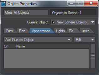
The Appearance tab replaces the Add Custom Object section in the Object Properties panel prior to 2018. Object Replacement is now achieved in the Primitive > Geometry sub-tab.
The list of Custom Objects is as follows:
Camera Mask
It is sometimes necessary to use a textured object for the background instead of using a Background Image (Effects Panel, Compositing Tab) for effects like casting shadows onto the background or when you want to move the background around. The Camera Mask custom object can be used to compute the exact Z distance needed to fill your camera view.
To use Camera Mask:
- Model a flat Z-facing rectangle object with the proper aspect ratio. For example, 640 mm x 480 mm for a 4:3 aspect ratio. Apply your surface texture.
- Load the object into Layout and parent it to the camera.
- Add the Camera Mask custom object plugin to the object. Enter the object’s size into its options dialog and then close it. You will then see a rectangle that represents the exact Z position where the object would fill the camera view. The numeric value of this magic distance is also displayed.
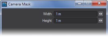
- Now, adjust the Z position of the object. You will see a representation of the camera view extend from the object with your textured rectangle attached to the end. If you have a Camera Mask set on the Camera Properties Panel, it will be visible.
Note that when the object is selected, the camera’s mask will appear as dotted lines. Otherwise, the mask will be the mask’s set color. (Note: You may see OpenGL display errors when the mask is solid.) - Adjust the object’s Z Position to the magic distance. The object will now fill the camera view.
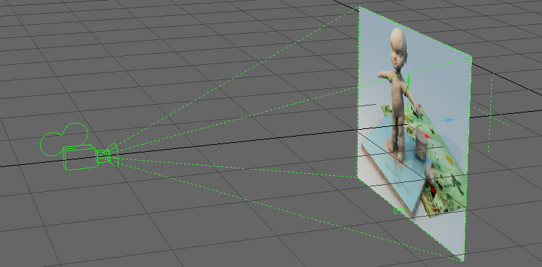
You might also use a background plane with parts cut out, in conjunction with a Background Image, so you can position things between the plane and Background Image.A cross (+) also appears, which marks the camera’s Focal Distance setting from the Camera Properties Panel.
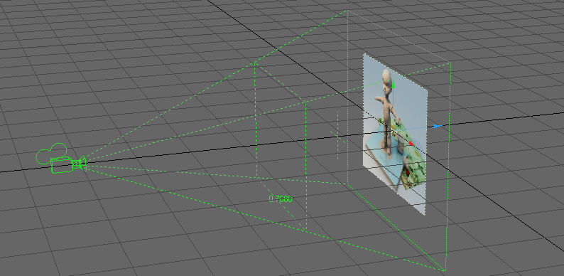
Depth of Field Display
The Depth of Field Display custom object is a handy tool for seeing your Focal Distance and Lens F-Stop Depth of Field settings found in the Camera Properties Panel. Anything that is located in the Focus shape will be in focus and anything outside of the Focus shape will be out of focus.
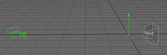
Steps for applying the DOF Display custom object:
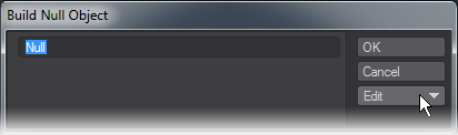
- Add a Null to your scene.
- Parent the Null to the camera.
- Activate Depth of Field in the Camera Properties Panel and adjust the Focal Distance and Lens F-Stop settings.
- Add the Depth of Field Display Custom Object from the Add Custom Object drop down menu.
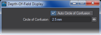
Use the numeric options to set the Circle of Confusion setting. This setting means the size of a point that is recognized as a single point. The smaller the value, the smaller the area will be in which objects are defined as ‘sharp’.
Dynamics Constraint
Indicates a Bullet Constraint has been added to the object.
Dynamics Force
Indicates a Bullet Force has been added to the object.
Effector
The Effector custom object can be used with the Effector Displacement plugin. This custom object is designed to give you better visual feedback of your effector in Layout. Note that it does not directly communicate with the related Displacement plugin, so all settings must be set manually.
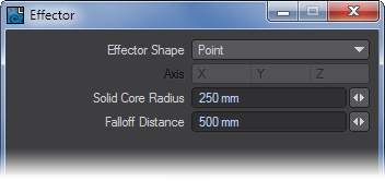
It has two modes to match the shape of the effector: Point and Plane.
When Effector Shape is set to Point, set the Solid Core Radius and Falloff Distance to match those settings on the Displacement plugin’s panel. The arrows and dotted-lines indicate the falloff area. The solid-line ball in the center is the solid core.
When Effector Shape is set to Plane, the effector will look like a four-sided plane. The Axis settings will become available, and you can then set them accordingly. The other settings have no effect in this mode.
Flock Director
Indicates that a Flocking Director has been added to the object.
Flock Generator
Indicates that a Flocking Generator has been added to the object.
Frame Rate Meter
Adding Frame Rate Meter to a null object will display frames-per-second information when you play a scene or drag the frame slider.
HyperVoxels Drawing (HV Custom Object)
This custom object is automatically placed in the Add Custom Object list when HyperVoxels are applied to an object.
IK Booster
IK Booster is discussed in the IK Booster section on page PDF_LINK. One option of applying IK Booster is to do it here in the Add custom Objects list. The preferred way is to add it with the IK Boost tool (Modify > IK Boost).
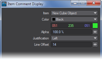
Item Comment Display
If you add a comment to a scene item using the Python Add_Scene_Comments script this plugin will be activated automatically. If you wish to add a comment to a scene item manually using the Items Comments plugin (Utilities > Additional > Comments), you can add the Item Comment Display custom object plugin and see the comment in your viewports.
The Item setting determines which scene item gets its comment displayed. It does not have to be the item you add the custom object plugin to. You also have control over the text Color, visibility (Alpha), and Justification.
Item Shape
Item Shape lets you specify the shape and look of your custom object. This is a great way to give each null in your scene a unique identity. When you create a null, clicking on the dropdown at the bottom of the window gives you access straight away to the Item Shape properties.
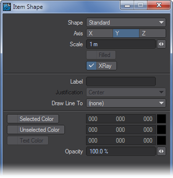
- Shape - Choose the actual shape that will be displayed. Your choices are Standard (Standard Null), Box, Ball, Pyramid, Diamond, Tetra, Ring, Grid, and None.
- Axis - Which axis the shape is facing. This is best represented with the Ring and Grid shape.
- Scale - Size of the shape.
- Filled - This checkbox will determine whether the shape is displayed in wire or solid.
- Label - Places a Label for the Item Shape.
- Justification - Label Placement with the standard choices Left, Center, Right.
- Draw Line To - Allows you to draw a dotted line to any item in the scene.
- Selected Color - Color the item shape will be when it is selected.
- Unselected Color - Color the item shape will be when it is not selected.
- Text Color - Color of the Label text.
- Opacity - Determines how opaque the item shape will appear.
Level-of-Detail Mesh Refinement
Adding the Level-Of-Detail Mesh Refinement custom object tool allows you to independently change the display and rendering resolution of SubPatch and Meta-primitives based on their distance from the camera. This can save you rendering time when those types of objects are sometimes close to the camera and sometimes far, during your animation.
From top to bottom, the entry groups must be in near-to-far order, so the furthest group is last. When the distance from the camera to the object is within each range, the corresponding Display/Render settings are used.
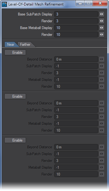
A value of -1 disables that (display/render) parameter. It is like deactivating the Enable option for a group, but lets you control it differently for individual items in that group.
In your viewport, concentric rings are displayed around the object showing the defined distance ranges.
LScript and LScript/RT
These two items will allow you to apply a Custom Object LScript.
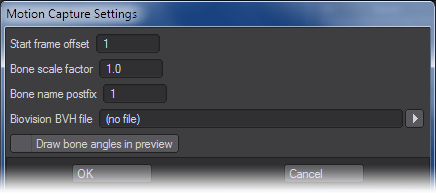
Motion Capture Preview
This custom object plugin can be used to preview BioVision motion data. The preview is fast and accurate. Use it to determine if there were any errors in the motion conversion.
Simply add the MotionCapturePreview custom object to a null object on the Object Properties Panel. (If you run the MoCap_BVH_Setup generic Layout plugin, a null called “MotionCapturePreviewNull” will automatically be added to the scene with the custom object plugin already applied.)
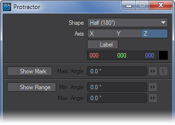
Protractor
Protractor sets up a custom object you can use to measure angles. With the Shape setting you can make it a Full or Half circle. The Label option places numerical labels at set intervals. Use the Show Mark option to place a tick mark at a set angle. Use Show Range to highlight a set range.
Python
Allows you to load a Python script.
Python Basic Barn
An example script to make a barn shape in Python. It doesn't render.
Range Finder
Adding Range Finder to an object will display the distance in meters from the selected item in the scene. The Draw Link option will draw a dotted line between the items.
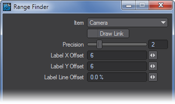
Null objects work best. However, if you add this to a regular object, you may want to use the Bounding Box rendering level (selected on the viewport’s titlebar). Otherwise, the object’s surface may obscure the numeric display.
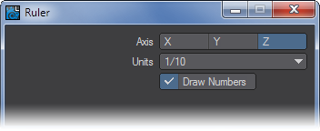
Ruler
Adding Ruler to a null object provides a measurement device. You can change the length of the ruler by stretching the object along the selected Axis. The units of measure can be 1/10 of a meter or feet/inches. The Draw Numbers option controls the display of the numbers.
ShowCurve
ShowCurve displays an object curve in Layout - normally curve objects are a Modeling tool and cannot be seen in Layout. (If there is more than one curve in the object, the first curve is used.)
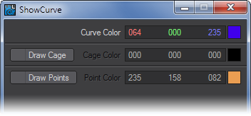
The color of the curve can be adjusted using the Curve Color setting on the Options Panel. The Draw Cage option, when active, displays the “cage” of the curve by connecting the vertices with dashed lines in a color of your choice. The Draw Points option, when active, adds arrowheads to each of the vertices to indicate the direction of the curve.
ShowCurve was designed to be used with the CurveConform displacement plugin.
Sliders
Sliders (Modify > Sliders) are slider gadgets that are displayed over viewports. An individual slider is tied to a specific animation channel. A slider will indicate the current value of a channel and also let you interactively adjust that channel value.
To configure your sliders:
Open the Sliders custom object settings dialog from the Object Properties Panel.
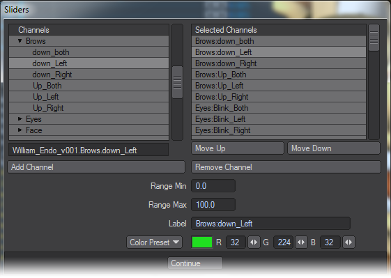
The left window (Channels List) will list all of the channels in the scene. To attach a slider to a channel, simply select the channel in the left window and click Add Channel. Selected channels in the right window can be removed with the Remove Channel button.
The Range Min and Range Max settings define the interactive range of the slider. The underlying channel can go beyond these values, but the slider’s range of control and feedback will be limited to this range. If the underlying channel goes outside of the range, the slider value will turn red. Clicking on the slider handle will immediately change the channel to the slider’s corresponding value.
The description Label will default to the channel name, but you may edit that if you desire. You can also set the color used for the slider with the Color preset pop-up menu or specific RGB values.
SockMonkey
The SockMonkey custom object plugin draws bounding boxes for links created in the main SockMonkey displacement plugin. However, if you use the Auto-add Control Item button on the main interface, this custom object plugin is automatically added to the created control item, so you don’t need to worry about adding this manually. If instead, you use the Add Relationship option - where you manually define the Control Item - you can add this custom object plugin to get the bounding box.
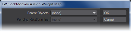
The Parent Object is the main SockMonkey object. The Pending Relationship is the related Vertex Group defined on the main interface. Once assigned, this dialog will no longer appear when you try to access the options. If not assigned to a link, adding this plugin does nothing.
Speedometer
Adding Speedometer to a null object allows you to measure the speed of an item in meters per second. Choose the item whose speed you wish to measure with the Item pop-up menu. Activate the World Coords option to measure the actual speed based on world coordinates. (You’ll probably want to do this if the item is parented to moving item.)
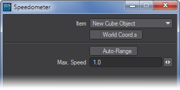
The Max Speed setting determines the value when the pointer is pegged all the way to the right. Select Auto-Range to have the plugin determine the maximum. Note that the pointer can go past the maximum if the speed exceeds it.
Visor
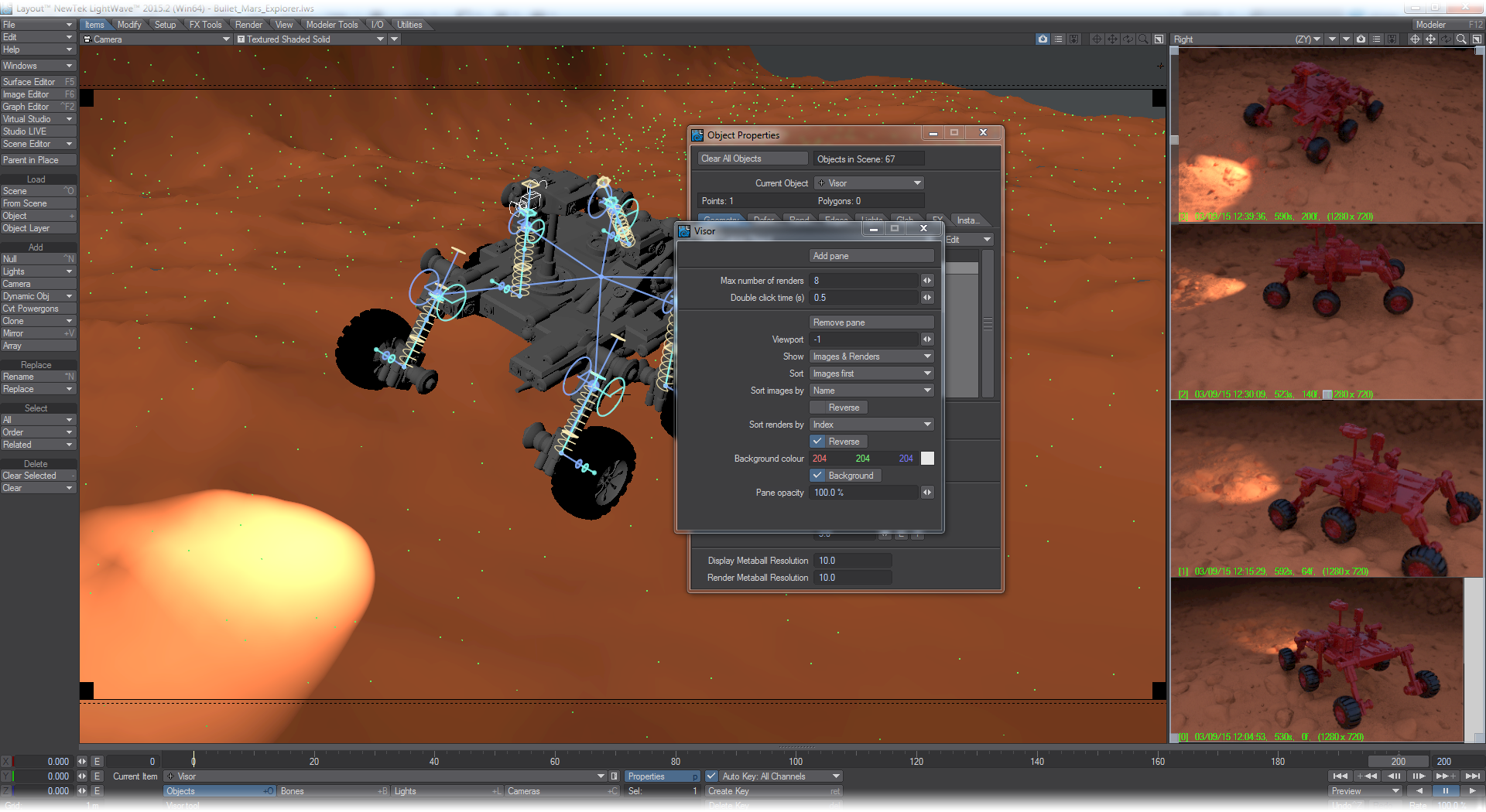
Visor shows images and renders in a Layout viewport. The images and renders are organized in panes. A pane can show one or more images and/or renders, and there can be multiple panes in multiple viewports. Panes can be arbitrarily sized from taking up very little space, to a strip along the side of a viewport, to covering an entire viewport. Visor can be used to keep reference photos conveniently available in Layout without having to open yet another window. Visor can also be used to show the last few F9 renders in a viewport without the need to have the render window open.
Interacting with a pane
A pane can be activated by clicking in it or by selecting the Null to which the Visor custom object is associated. Note that sometimes other items in the scene may interfere with clicking in the pane. Clicking near the corners usually works best.
If there are multiple panes, all the panes will at first become active. You can then click on the pane you want to work with by clicking in it again.
An active pane will show six gray handles. Four in the corners that can be dragged around to resize the pane, one on the border that is a slider if there are more image than can be shown in the pane and one in the center to move the pane. You’ll need to add some images with the Image Editor or by rendering in order for the slider to be useful.
The panes can be deactivated by selecting some item in the scene. Initially you may have to do this by changing the Current Item. Afterwards Visor will keep track and return you to the last tool used and the items last selected.
Images and renders
Panes can show both images present in the Image Editor, and any F9 renders. To have an image show up in a pane, simply load the image into the Image Editor.
To have renders appear in panes, the Render Display in the Render Options has to be set to the entry called Render2Image. This option is added by Visor and it adds renders to the Image Editor instead of renders appearing in the render display. From there they are picked up by the Visor panes.
Visor can be used without using Render2Image, but F9 renders won’t appear in the panes.
References to images which are shown in a pane will be saved into the scene file, even if they aren’t used as part of the scene. However, this does NOT apply to renders. Renders will be lost if the scene is cleared (you can always access a render through the Image Editor and save any you want to keep from there). For renders, depending on how much space is available, Visor shows some helpful information about each render, for example:
[8] 05/05/15 01:28:12, 73s, 12f, (1280 x 720)
This reads as: this is the 8th render made, at the given date and time, took 73 seconds to render, it’s a render of frame number 12, and was rendered at a size of 1280 by 720 pixels.
The interface
The interface can be opened either by double clicking on the Visor custom object entry, or by double clicking on an active Visor pane.
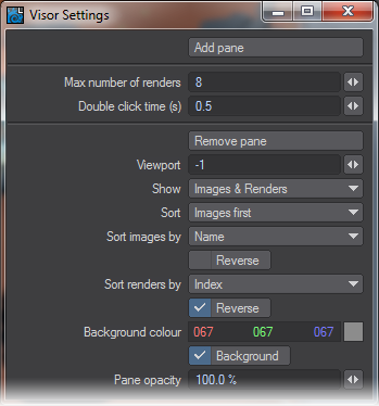
As well as a button to add a new pane, there are also a set of global settings, and a bunch of settings for the currently active pane.
Global settings
- Max number of renders - Each rendering takes up memory to keep around. The number of renders Visor keeps around is limited to the given number of most recent renders. If the maximum number of renders is reached, the oldest render is deleted. Note that this does not affect images, only renders. Default: 8
- Double click time - This gives the maximum amount of time (in seconds)between clicks on a pane in order for it to be registered as a double click. Double clicks on an active pane open up the Visor interface. Default: 0.5
Pane settings
- Remove pane - Clicking this button removes the currently active pane.
- Viewport - Sets the index of the viewport in which the current active pane is placed. Viewports are numbered from zero up to a maximum of three. 0 means the first viewport, 1 the second, and so on. Which viewport is the first, second, and so on depends on the viewport layout. Negative viewport numbers indicate a viewport index relative from the last viewport. So -1 means that he pane will always appear in the last viewport, -2 means the second to last, and so on. Default: -1
- Show - Selects if the currently active pane will show images only, renders only, or both types. Default: Images & Renders
- Sort - Sets the sorting order between images and renders for the currently active pane. Default: Images first
- Sort images by - Sets the sorting order of the images (if there are any) for the currently active pane. If Reverse is checked, the ordering of the images is reversed. Default: Name
- Sort renders by - Sets the sorting order of the renders (if there are any) for the currently active pane. If Reverse is checked, the ordering of the renders is reversed. Default: Index, Reverse
- Background color - Gives the color used to fill the background of the currently active pane. If Background is checked, the background is drawn, otherwise it isn’t drawn. Default: 204 204 204, Background
- Pane opacity - Sets the opacity with which the currently active pane is drawn. The pane opacity is only used if the pane is not active. When the pane is active, it will always be drawn completely opaque. Default: 100.0%
You can send images rendered to the Image Viewer to Visor using the File > Frame Buffer > Auto-Send function.
Example - Setting Up Visor
VRML97 Custom Object
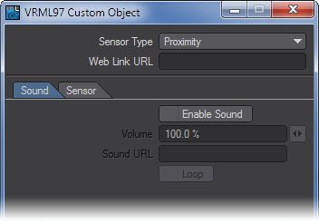
The VRML97 custom object can be applied to an object to make its VRML attributes visible in Layout. It will display URLs, the Proximity-Sensor bounding box, LOD ranges, sound nodes, and links to alternate triggers.